The Art of Thumbnails: Increasing Click-Through Rates on YouTube

The Thumbnail Is the Ad
Most creators spend hours filming and editing, then throw together a thumbnail in five minutes. That ratio is backwards. A poll found that time creators spend on thumbnails is under 30 minutes for 64% of creators, which means the thing that determines whether anyone watches is also the thing getting the least attention. Your video could be the best content on the platform, but if the thumbnail does not stop someone mid-scroll, nobody watches it.
YouTube is a search engine and a browsing platform at the same time. When someone is scrolling through their homepage or a search results page, they are making split-second decisions about what to click. The thumbnail and the title work together as a unit, and the thumbnail carries most of the visual weight. A strong click-through rate signals to YouTube's algorithm that people want to see your content, which means more distribution, which means more views. The whole growth loop starts with that small image.
This article is about building thumbnails that actually perform: what makes them work psychologically, how to design them practically, what tools to use, and what mistakes to stop making.
What High-Performing Thumbnails Actually Have in Common
There is no single formula, but there are consistent patterns across channels that get strong click-through rates.
Immediate Visual Clarity
A thumbnail has to communicate something useful in under a second. If a viewer has to study it to understand what the video is about, it has already failed. The best thumbnails have one dominant visual element: a face, an object, a number, a before-and-after. Everything else supports that element rather than competing with it.
Clutter is the enemy. Many creators try to pack in too much information because they are afraid of leaving something out. The result is a thumbnail that reads as noise. Viewers do not stop to decode it; they scroll past.
Faces and Emotional Expression
Human faces draw attention. This is not a design preference; it is how human perception works. We are wired to look at faces, and we read emotion from them almost instantly. Data also suggests that thumbnails featuring multiple faces performed best compared to single-face thumbnails, so when the content allows for it, including more than one person can give you an edge.
The expression matters as much as the face itself. Surprise, shock, excitement, and confusion all perform well because they create a question in the viewer's mind: what happened to cause that reaction? That question is what drives the click. Flat or neutral expressions do not create that tension.
Contrast and Color
Your thumbnail competes with dozens of others on screen at the same time. High contrast between the subject and the background makes it pop. Bright colors against dark backgrounds, or dark subjects against light ones, create the visual separation that catches the eye.
Some creators develop a consistent color palette across all their thumbnails. This builds recognition over time. When a subscriber sees that specific combination of colors, they associate it with your channel before they even read the title. That recognition is a form of trust, and trust drives clicks.
Text That Adds, Not Repeats
Not every thumbnail needs text. When text is used, it should add information that the title does not already provide, or it should amplify the emotional hook. Keeping thumbnail text length to 3-5 words maximum is the standard recommendation, and the font should be large enough to read on a mobile screen. The majority of YouTube views happen on smaller displays.
A common mistake is writing the same thing in the thumbnail text that is already in the video title. That wastes the space. If your title says "I Tried the World's Hottest Pepper," your thumbnail text should not say "World's Hottest Pepper." It might say "I Regret This" or show a number like "2 Million Scoville" that adds context.
The Curiosity Gap
The most effective thumbnails create a gap between what the viewer knows and what they want to know. They suggest a payoff without fully delivering it. This is sometimes called an open loop.
A thumbnail showing someone standing in front of a destroyed car with an expression of disbelief creates a gap. What happened? A thumbnail showing a before-and-after of a room renovation creates a gap. How did they do that? The click is the viewer's attempt to close that gap.
The gap has to feel genuine. If the thumbnail implies something the video does not deliver, viewers leave quickly, watch time drops, and YouTube deprioritizes the video. Clickbait works once. It destroys channels over time.
Designing Thumbnails That Work at Small Sizes
Most thumbnail design advice focuses on how things look at full size. The actual viewing context is much smaller. On a mobile phone, a YouTube thumbnail might be displayed at roughly the size of a business card. On a TV, it is larger but viewed from across the room, and YouTube viewing on TV now surpasses both mobile and desktop in the U.S., making that distance a real design consideration.
The practical implication is that fine detail does not matter. Subtle textures, thin fonts, and small decorative elements all disappear at scale. What matters is the large-scale composition: the relationship between the main subject, the background, and any text.
A useful test is to shrink your thumbnail down to about 120 pixels wide and see if it still communicates clearly. If the main message survives at that size, the design is working. If it turns into an unreadable blur, simplify it.
The Rule of Thirds (and When to Break It)
Placing your main subject slightly off-center, in one of the thirds of the frame, tends to create more dynamic compositions than centering everything. It also leaves space for text without it overlapping the subject's face.
That said, centered compositions with strong symmetry can work well for certain styles and topics. The rule is a starting point, not a law. What matters is that the composition feels intentional rather than accidental.
Background Choices
A plain, solid-color background is often the strongest choice for thumbnails that feature a person. It removes visual competition and makes the subject stand out. Gradients work well too. Busy, photographic backgrounds can work if there is enough contrast between the subject and the background, but they require more careful design.
If you are shooting your thumbnail photo specifically (rather than pulling a frame from the video), shooting against a plain backdrop gives you maximum control. Many creators keep a simple paper or fabric backdrop in their filming space for exactly this purpose.
Tools for Making Thumbnails
The tool matters less than the skill, but some tools make the process significantly faster.
Canva is where most creators start, and for good reason. It has a large library of YouTube thumbnail templates, is easy to learn, and handles text and basic graphic elements well. The free tier is functional, and the paid tier adds access to a background remover and more assets. It runs in the browser, so there is no software to install.
Adobe Photoshop is the professional standard. It gives you complete control over every element, handles complex compositing and retouching, and produces the highest quality output. The learning curve is steeper and the subscription cost is higher, but for creators who want to push their thumbnails further, it is worth it.
Adobe Express sits between Canva and Photoshop in terms of complexity. It is free at a basic level and integrates well with other Adobe tools.
Figma is primarily a UI design tool but works well for thumbnail design, especially for creators who are already comfortable with it. The free tier is generous.
For creators who want to remove backgrounds from photos, dedicated tools like Remove.bg handle this quickly without needing a full design application.
AI Thumbnail Tools
Several AI tools now generate thumbnail concepts or enhance existing designs. Midjourney, Adobe Firefly, and similar image generation tools can create background images, visual elements, or entirely AI-generated scenes that you then composite with text and other elements.
ChatGPT itself does not generate images in the traditional sense through its standard interface, though OpenAI's image generation capabilities (available through certain products) can produce visual content. For thumbnail creation specifically, dedicated AI image generators tend to produce more useful output than general-purpose chatbots.
The honest assessment of AI thumbnail makers is that they are useful for generating background images and visual elements, but they are not yet reliable for producing complete, ready-to-use thumbnails. The best results come from using AI to generate raw material that you then design around, rather than expecting a finished product.
Common Mistakes That Kill Click-Through Rates
Using a Video Frame Instead of a Designed Thumbnail
Pulling a random frame from your video and uploading it as a thumbnail is the single most common mistake. Video frames are not designed to be thumbnails. They are usually mid-motion, have inconsistent lighting, and lack the visual hierarchy that makes a thumbnail work. Even a quickly designed thumbnail in Canva will outperform a video frame in almost every case.
Too Many Elements
Three faces, four text blocks, a logo, a border, and a background scene all fighting for attention is not a thumbnail; it is a ransom note. Pick one thing to be the hero of the image and let everything else support it.
Fonts That Are Too Small or Too Thin
Thin, elegant fonts look good on a poster. They become unreadable on a YouTube thumbnail viewed on a phone. Bold, high-contrast fonts with a clear outline or drop shadow hold up at small sizes. If you have to zoom in to read your thumbnail text, the font is wrong.
Inconsistency Across the Channel
Thumbnails that look completely different from each other make a channel feel disorganized. Viewers who find your content through one video and then browse your channel page should see a coherent visual identity. This does not mean every thumbnail has to be identical, but a consistent color palette, font choice, and general style builds recognition.
Misleading Thumbnails
Showing something in the thumbnail that does not appear in the video, or implying an outcome the video does not deliver, is a short-term strategy with long-term consequences. YouTube tracks audience retention and viewer satisfaction signals. Videos that get clicks but lose viewers quickly get buried. The thumbnail has to be a genuine preview of the value inside the video.
Ignoring Mobile
Designing a thumbnail on a large monitor and never checking how it looks on a phone is a common oversight. With users averaging time spent on YouTube's Android app of 27 hours and 43 minutes per quarter, the mobile experience is where most of your audience actually lives. What looks balanced on a 27-inch screen can look crowded or unreadable on a 6-inch phone screen. Always check your thumbnail at mobile size before publishing.
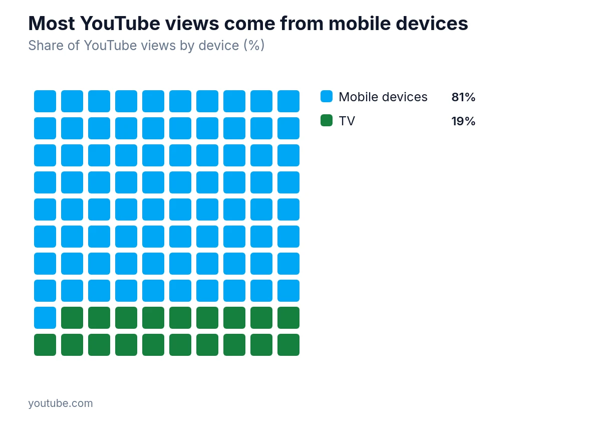
Eighty-one percent of YouTube views come from mobile devices, so check thumbnails at phone size before publishing.
Building a Thumbnail System
The creators who consistently produce strong thumbnails are not reinventing the wheel for every video. They have a system.
A basic system might look like this: a Photoshop or Canva template with the channel's fonts, colors, and logo already placed, with placeholder areas for the main image and text. For each video, you swap out the photo and the text, adjust colors if needed, and export. The whole process takes fifteen minutes instead of an hour.
This consistency also makes A/B testing easier. YouTube A/B testing selection works by picking the title or title-and-thumbnail combination with the highest watch time and showing it to all viewers, so the metric being optimized is not just clicks but sustained engagement. If your thumbnails all look completely different, it is hard to draw conclusions from these tests. If they share a consistent structure, you can isolate which specific element (the expression, the text, the color) is driving the difference.
Reading Your Analytics to Improve Over Time
YouTube Studio shows click-through rate data for every video. The industry average varies by channel size and niche, but a CTR below two percent generally indicates a thumbnail or title problem. A CTR above six or seven percent is strong for most channels.
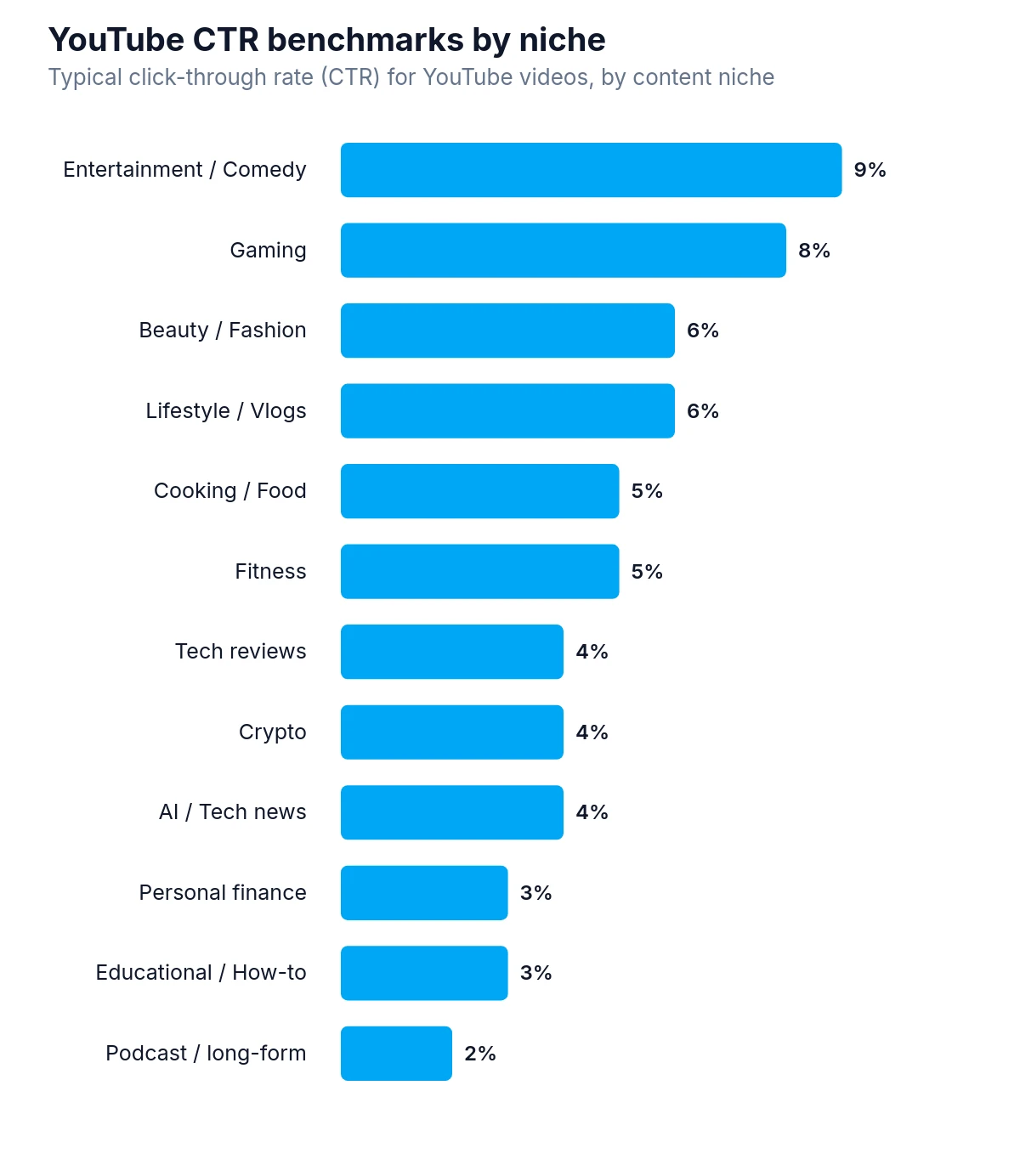
Entertainment and comedy videos have the highest typical YouTube CTR at nine percent.
Look at which of your videos have the highest CTRs and study those thumbnails. What do they have in common? High contrast? A particular expression? A specific color? Then look at your lowest performers and ask the same question in reverse.
CTR does not exist in isolation. A very high CTR with very low average view duration means the thumbnail is promising something the video does not deliver. The goal is a high CTR combined with strong watch time, because that combination is what YouTube's algorithm rewards with distribution.
Impressions also matter. A video might have a high CTR but low total views because it is not being shown to many people. In that case, the thumbnail is doing its job but the title or topic may not be matching search intent well enough to generate impressions.
The Thumbnail Starts Before You Film
The best thumbnails are planned before the camera starts rolling. If you know you want a shocked expression in the thumbnail, you can shoot that expression deliberately during or after filming. If you want a specific prop or visual in the thumbnail, you can set it up intentionally.
Creators who think about the thumbnail after the fact are limited to whatever happened to be captured during filming. Creators who plan the thumbnail as part of pre-production have complete control over the image.
This shift in mindset, treating the thumbnail as a designed piece of content rather than an afterthought, is what separates channels that grow from those that plateau. The video earns the viewer's time. The thumbnail earns the click that makes any of that possible.